Behind our branding. How we got here.
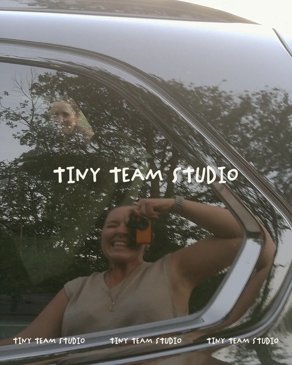
We went through a few iterations of our branding before we found something that really spoke to us.
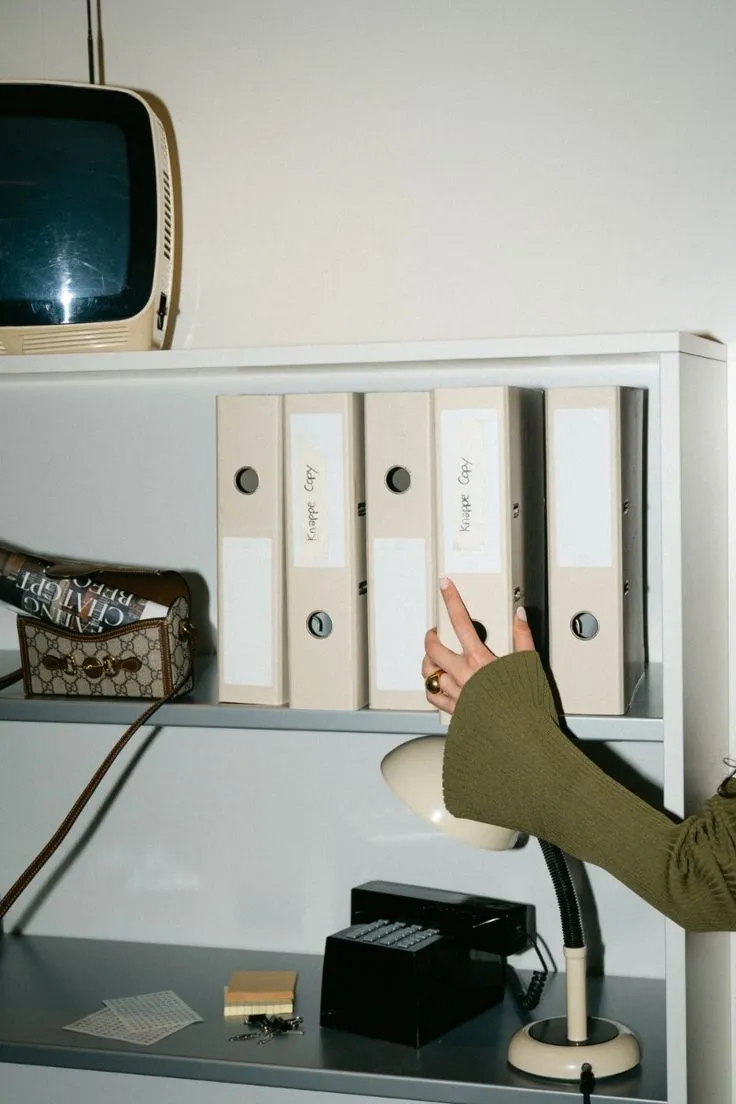
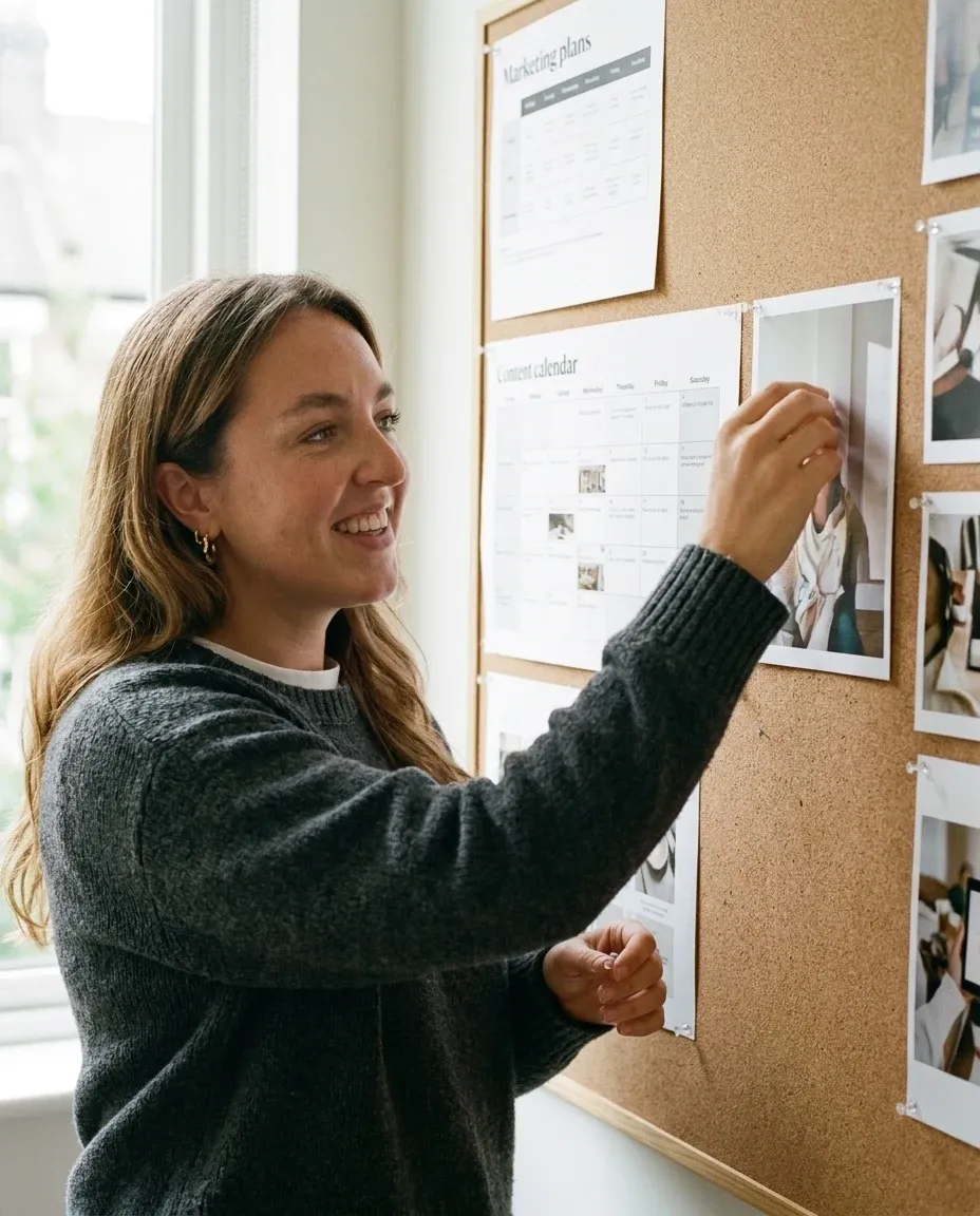
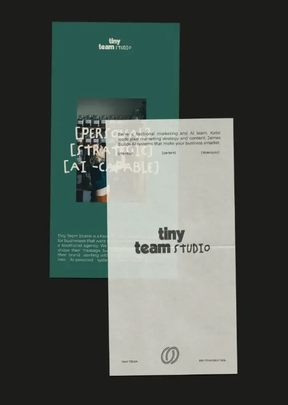
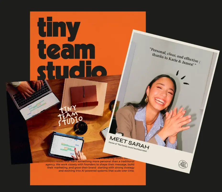
We wanted something that felt entirely physical, but had elements that nodded to technology. Whether that was through fonts or through icons or through type spacing.
We wanted the branding to embody the contrast in both mine and James’s expertise but find a way where they could work cohesively together.
At a glance.
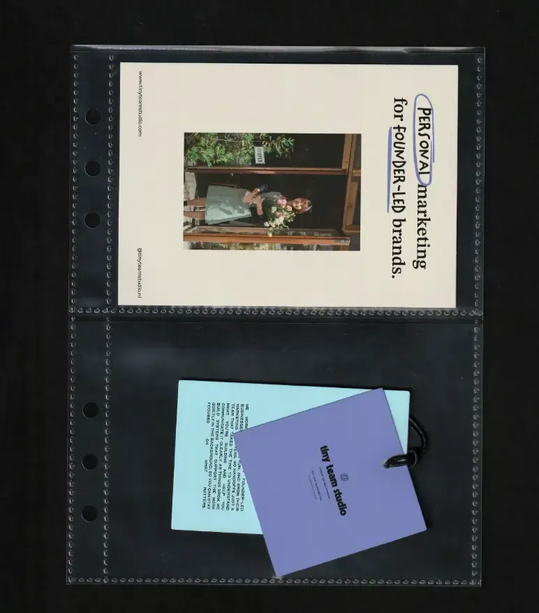
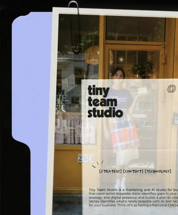
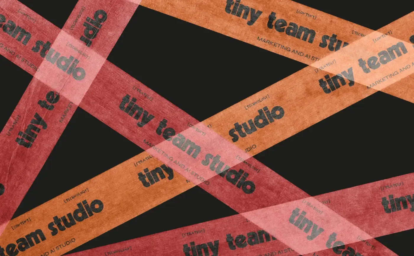

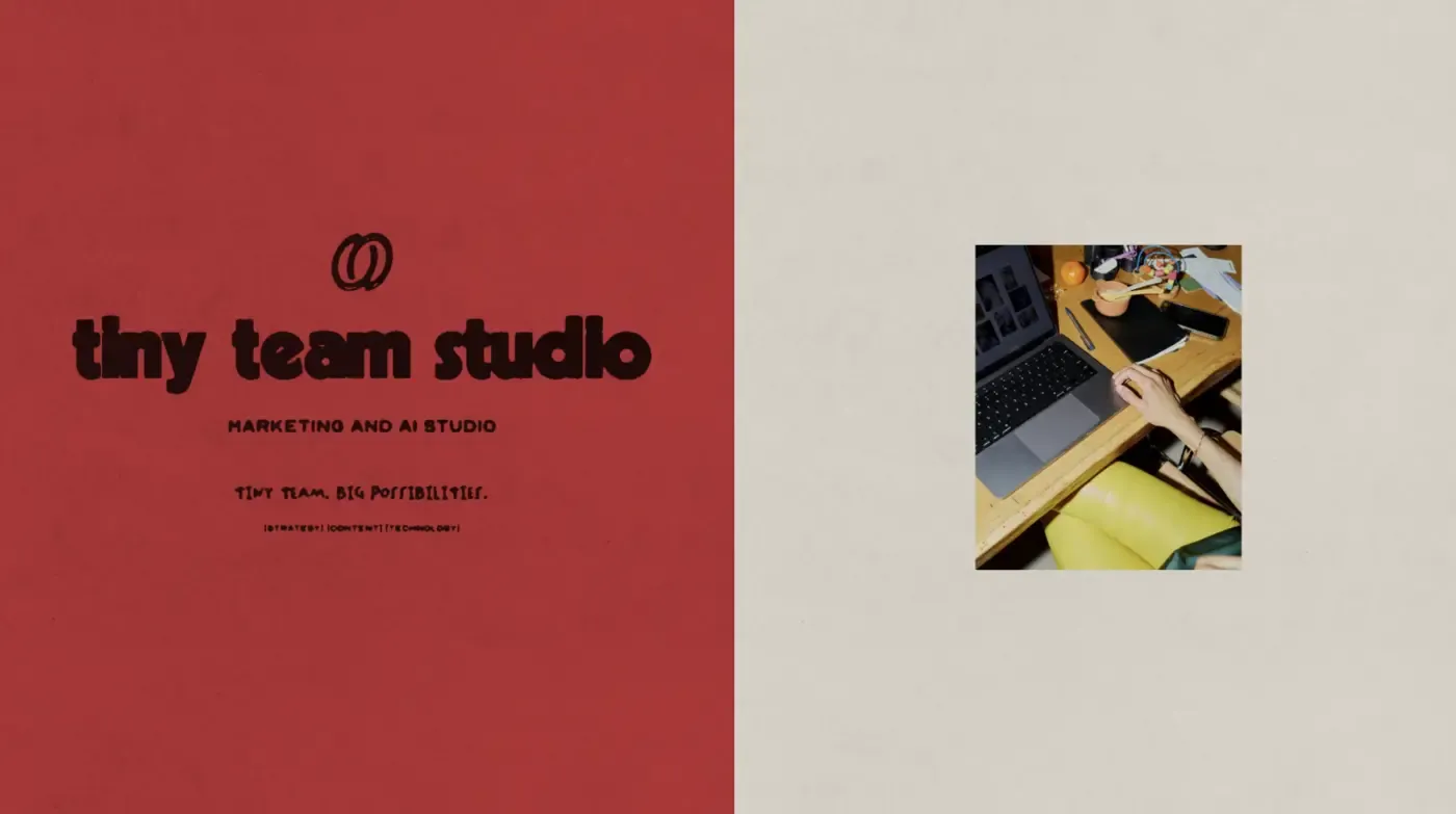
A little more insight.
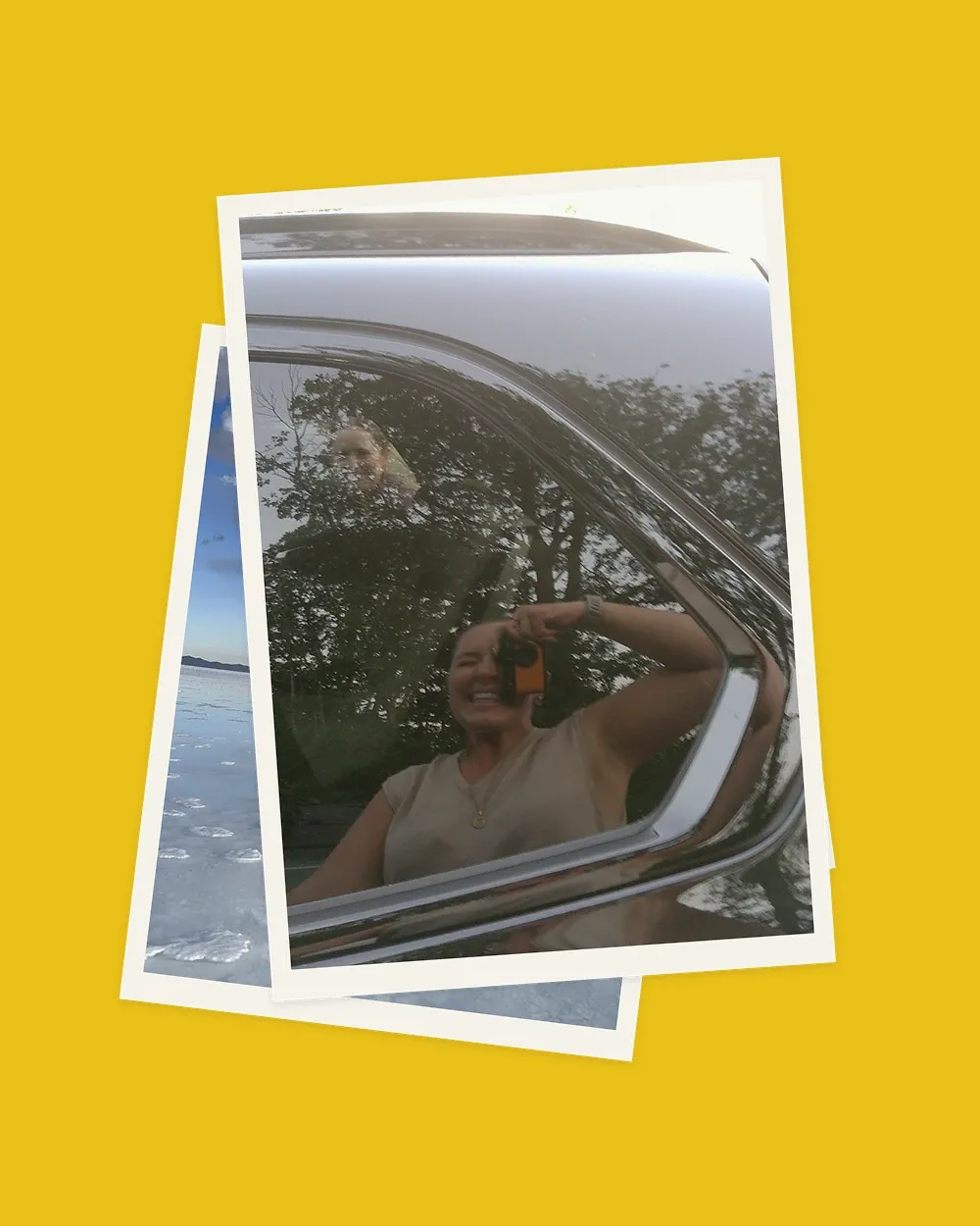
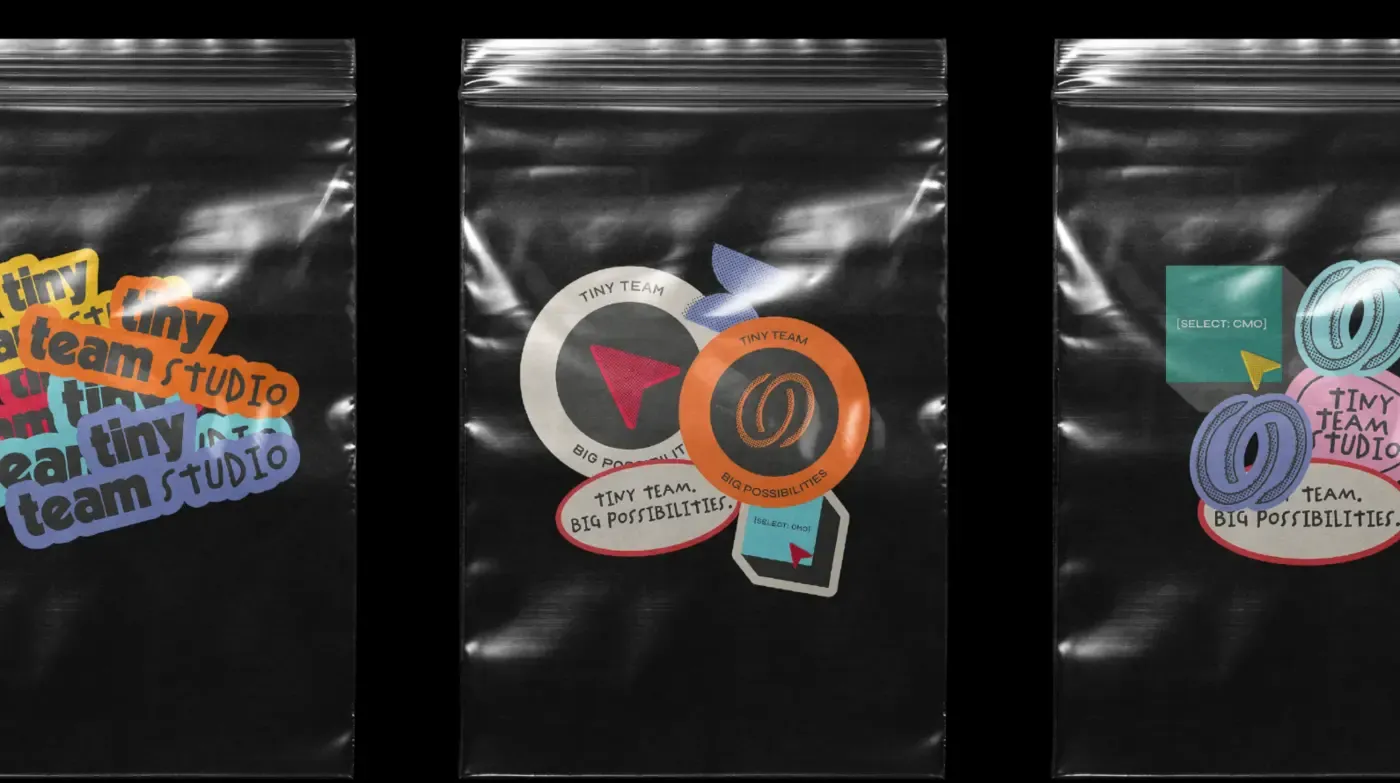
I create scrapbooks every year and for every country that we travel to. It is somewhat a hallmark of mine and James’s relationship. As we enter into this new chapter of our relationship being business partners, we thought this would be an interesting element to bring into the Tiny Team Studio branding without coming across as childish or scrappy, but a balance of who I am and who James is.
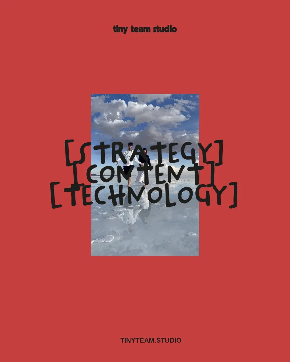
We liked how there were so many contrasts in what was presented to us: linear fonts Vs handwritten fonts or warm colours Vs cool colours and scribbles Vs icons.
You can really see this particularly in our logo, which is two concentric circles. It’s like a Venn diagram; what I do is one and what James does is the other half with Tim being the piece in the middle.
Within all this contrast, we have managed to find a perfect balance.
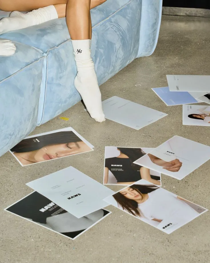
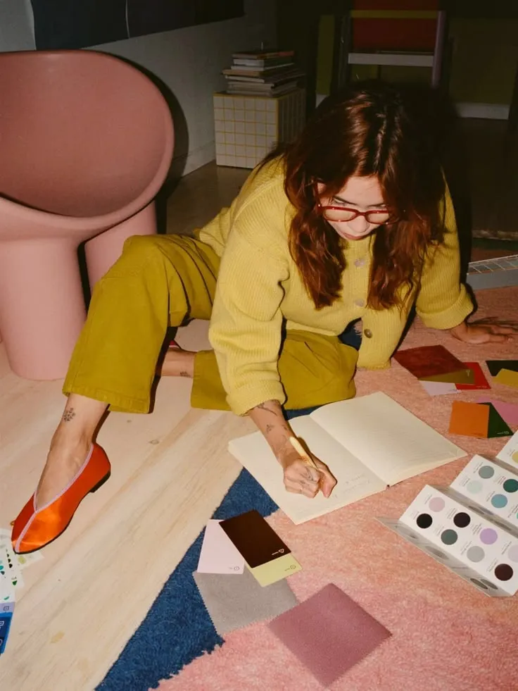
We wanted to find the right balance between physical & digital. Smooth & texture. Bold & restrained. What we do does not traditionally match, so having branding that has contrasts felt right.